Choosing a quartz colour for your Indian home is one of those decisions that feels simple until you are standing in a showroom with 200 slab options in front of you. The wrong choice — too cold, too busy, too light, or clashing with your cabinet — can undermine an otherwise beautifully designed room. The right choice unifies the entire interior and creates a surface that looks as good in ten years as it did the day it was installed.
This room-by-room guide is built on Universal Quartz’s 20 years of advising Indian homeowners, interior designers, and architects on colour selection for kitchens, bathrooms, living rooms, and bedrooms across India’s diverse regional design preferences — from the warm sandstone tones of Rajasthan to the cool, clean aesthetics of Mumbai’s premium apartments and the bold design language of Bangalore’s tech-sector homes.
Each room section follows the same structure: the key design principles, a swatch-by-swatch recommendation from the Universal Quartz range, and the specific Indian factors — vastu, regional aesthetics, lighting, humidity — that should influence your choice.
1. The colour selection framework: four factors for every room
Before going room by room, apply these four factors to every surface decision. They are the lens through which every specific recommendation in this guide was made:
| Factor | What to assess | Why it matters for India |
| Room size | Total floor area and ceiling height | Smaller Indian apartments (650–1,200 sq ft) require lighter tones to avoid surfaces feeling heavy. Light quartz expands perceived space; dark tones contract it. |
| Natural light | Direction, quantity and quality of daylight | North-facing rooms in India receive indirect light — lighter, cooler tones work best. South-facing rooms flood with warm light — both warm and cool tones work. Basement or dark rooms need the lightest, most reflective quartz available. |
| Cabinet colour | Your cabinet, furniture, and floor tile palette | Your quartz is the 30% secondary colour in the 60-30-10 design rule. It must complement — never compete — with your dominant cabinet or wall colour. Always bring a physical cabinet sample when selecting quartz. |
| Vastu direction | The wall or zone your surface occupies in the room | Vastu principles associate colours with directions: East (green, light tones), South-East (red, orange, warm tones), North (blue, grey, cool tones), South-West (earthy, beige tones). Quartz is a neutral material — its colour can be chosen to support the directional element. |
The Kitchen
Your most-used surface — practicality and palette must work together
Kitchen colour principles for Indian homes
- Light kitchens feel larger — the average Indian modular kitchen is 80–120 sq ft, often in a straight or L-shape. Light quartz (white, ivory, cream, soft grey) reflects light and makes the space feel more open. This is the dominant reason light-coloured quartz outsells dark tones in Indian kitchens by a ratio of roughly 3:1.
- Warm tones suit traditional and transitional kitchens — if your cabinets are wood-finish, teak, or warm brown, a warm beige or gold-veined quartz creates cohesion. Cool white quartz against warm wood creates a jarring contrast that many Indian homeowners find uncomfortable.
- Dark quartz suits contemporary modular kitchens — if you have chosen a handleless modular kitchen in matte grey or charcoal, a dark quartz countertop in slate or deep charcoal creates a monolithic, premium look that is extremely popular in high-end Gurugram and Mumbai kitchens.
- Avoid high-contrast veining in small kitchens — bold Calacatta-style black-on-white veining can look spectacular in large kitchens with generous natural light, but in a compact Indian kitchen, it can feel visually overwhelming. Reserve bold patterns for one surface — an island or a windowsill — not the entire countertop run.
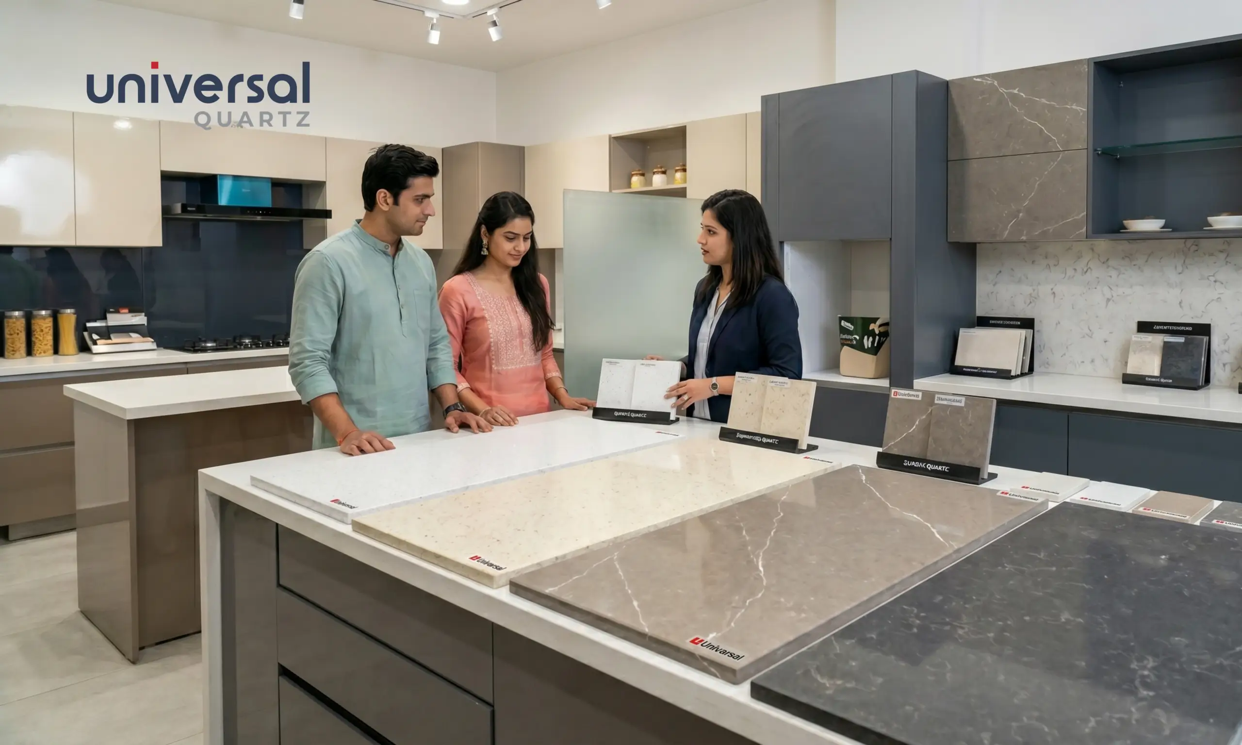
Universal Quartz kitchen colour recommendations
| Ivory White Harmony Series | Finish: Polished or matte The most versatile quartz colour for Indian kitchens. Ivory-white reads warm rather than cold under Indian kitchen lighting, pairs with both white and wood cabinets, and hides the day-to-day marks of cooking better than pure white. Polished or matte finish both work. |
| Warm Beige Jupiter Series | Finish: Matte preferred Ideal for traditional Indian kitchens with wood-tone or shutter-style cabinets. The warm sandy undertone references Indian sandstone aesthetics and sits comfortably in Rajasthani, Gujarati, and South Indian traditional interiors. Matte finish is preferred to reduce glare. |
| Soft Grey Venus Series | Finish: Matte The contemporary choice. Soft grey reads as modern and professional, pairs easily with white, grey, or dark modular cabinets, and ages extremely well — it never goes out of fashion. Light grey in matte finish is particularly popular in Bangalore and Mumbai apartments. |
| Charcoal Slate Jupiter Series | Finish: Polished for high-end contemporary kitchens with dark or handleless cabinets. Charcoal quartz creates a dramatic, premium look. Specify a polished finish for maximum depth effect. Works best in kitchens with strong natural or artificial light to prevent the space from feeling dark. |
| Calacatta-Look White Harmony Series | Finish: Polished The aspirational marble-look without marble’s maintenance penalties. White base with grey veining creates the kitchen aesthetic most Indian homeowners want — but quartz delivers it without the etching, sealing, and turmeric anxiety that real Calacatta marble creates. Best in large kitchens with good light. |
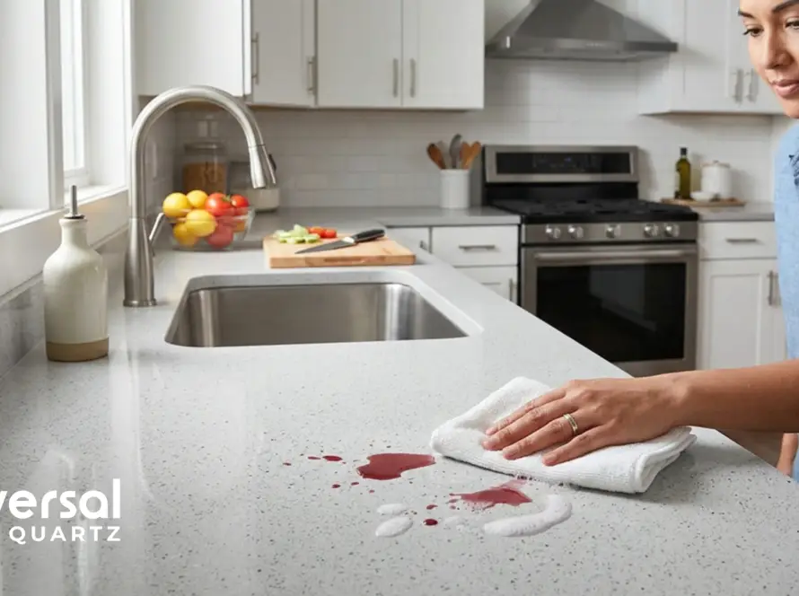
| Kitchen colour tip: always assess samples under kitchen lighting. Quartz colours look dramatically different under LED kitchen spotlights vs the ambient showroom lighting in which you select them. Always request an A4 physical sample and assess it in your actual kitchen space at different times of day before confirming. Universal Quartz provides free samples at all our showrooms and authorised dealer locations across India. |
Read More: kitchen countertop design
The Bathroom
Non-porous surface meets design opportunity — colour amplifies space
The Indian bathroom presents a unique colour selection challenge: it is typically the smallest room in the house (40–80 sq ft in most urban apartments), it has limited natural light, and it must feel clean, hygienic, and spacious simultaneously. Quartz colour can do a great deal of work in a small bathroom — when chosen correctly.
Bathroom colour principles
- Light colours are essential in small Indian bathrooms — a bathroom under 60 sq ft should use the lightest quartz available on the vanity top. White, ivory, or very light grey reflects light and prevents the space from feeling like a box. Every square foot of light-coloured quartz on a vanity top contributes to the room’s perceived size.
- Marble-look for master bathrooms — larger master bathrooms in premium apartments (80–120 sq ft) can carry bolder quartz choices. The Harmony series Calacatta-look and Statuario-look patterns provide the luxury hotel aesthetic that is the aspiration of India’s premium residential market, without marble’s maintenance burden in a moisture-heavy environment.
- Dark feature walls, light vanity — the most sophisticated Indian bathroom design in 2025 pairs a dark quartz feature wall (Jupiter or Neptune series) with a light vanity top. The contrast creates drama without making the room feel small — the dark tone is vertical, not horizontal.
- Consider the tile — in most Indian bathrooms, quartz covers the vanity top only (and sometimes a feature wall). The dominant visual surface is still the floor and wall tile. Always bring a tile sample when selecting vanity quartz — they must work together, not fight.
Universal Quartz bathroom colour recommendations
| Pure White Venus Series | Finish: Matte The classic choice for compact Indian bathrooms. Pure white quartz makes the room feel larger and brighter, photographs beautifully, and projects clinical cleanliness. Matte finish hides water marks and soap residue better than polished in a daily-use bathroom. |
| Light Ivory Harmony Series | Finish: Matte or polished. Warmer than pure white — avoids the cold, sterile feeling that pure white can create under harsh bathroom lighting. Particularly well-suited to bathrooms in North Indian homes, where warm beige and cream are the dominant interior palette. |
| Pale Calacatta Harmony Series | Finish: Polished Calacatta-look veining on a pale cream base. Creates the luxury spa-hotel aesthetic that is the top aspiration for master bathroom design in India’s premium apartment market. The marble look without the maintenance anxiety in a moisture-heavy environment. |
| Midnight Blue-Black Neptune Series | Finish: Polished For feature walls and statement vanity fronts in luxury bathrooms. Deep midnight tone creates drama and depth. Always pair with a light vanity countertop to balance. Best in bathrooms with warm artificial light — cold LED can make this tone feel harsh. |
| Warm Stone Grey Saturn Series | Finish: Matte The practical choice for high-use family bathrooms with multiple daily users. Warm stone grey hides everything — water marks, soap drips, daily marks — and looks consistently presentable without daily attention. The workhorse of bathroom quartz. |
The Living Room
Quartz in living spaces — TV backs, bar tops, console surfaces, feature walls
Quartz is increasingly used in Indian living rooms beyond the kitchen and bathroom. The most common applications are TV unit back panels, home bar countertops, console table tops, pooja room surfaces, and feature accent walls. Each application has its own colour logic.
Living room quartz applications and colour guidance
| Application | Recommended tone | Design rationale |
| TV unit back panel | Dark charcoal, black, or deep grey (Jupiter/Neptune) | Creates a dramatic backdrop for the TV screen. Dark tone recedes visually, making the TV the focal point. Polished finish reflects ambient light subtly. |
| Home bar countertop | Dark slate or deep green (Jupiter/Mars) | Home bar surfaces signal premium entertainment. Dark tones work with brass or black fixtures — the dominant hardware choice for Indian home bars in 2025. |
| Console/foyer table top | Marble-look white or light grey (Harmony) | First impression surface. Calacatta or Statuario-look in polished finish creates a premium entrance statement. Light tone reflects foyer light. |
| Pooja room surface | Pure white or light cream (Venus/Harmony) | Vastu-appropriate clean white or cream. Non-porous quartz is ideal for pooja surfaces — resists incense ash, flower water, and daily cleaning easily. |
| Feature accent wall | Bold veined or textured tone (Harmony/Jupiter) | 12mm quartz cladding panels as an accent wall. One bold surface in an otherwise neutral living room creates a gallery-worthy focal point without overwhelming the space. |
| Window sill / ledge | Match the wall or floor tile tone (any series) | Window sills should recede, not compete. Choose a tone within two shades of your wall colour for seamless visual flow. |
The Bedroom
Calm, restorative tones — quartz for wardrobes, ledges, and accent surfaces
Quartz in Indian bedrooms is most commonly used for wardrobe shutters (quartz-look laminates are common, but actual quartz is increasingly used for premium wardrobes), window sills, bedside ledges, study desk surfaces, and the occasional feature wall behind the bed.
Bedroom colour principles for Indian homes
- Restful tones dominate — the bedroom should feel calm, restorative, and private. Avoid very high-contrast, visually active quartz patterns in bedroom applications. Soft, low-movement tones — pale grey, warm off-white, gentle beige — create the right environment.
- Warm tones suit most Indian bedrooms — Indian bedroom palettes tend toward warm wood furniture, warm wall paint, and warm bedding. A cool white quartz study desk or windowsill can feel disconnected in a warm-toned room. Ivory or warm grey bridges this gap naturally.
- Feature wall considerations — a quartz panel behind the bed (as a headboard feature wall) is a growing trend in India’s premium apartment segment. For this application, subtle veining in a tone that matches or contrasts with the bedding palette works best. Avoid very light tones in this position — they can feel sterile in a bedroom context.
Universal Quartz bedroom colour recommendations
| Warm Off-White Harmony Series | Finish: Matte The safest and most beautiful bedroom quartz. Warm off-white works with every bedroom palette — wood furniture, upholstered beds, painted walls. The slight warmth prevents the sterile feel of pure white. Ideal for study desk surfaces, window sills, and bedside ledges. |
| Greige (Grey-Beige) Saturn Series | Finish: Matte The contemporary neutral. Greige reads as both warm and cool depending on the light — it adapts to its environment rather than dominating it. Suits the neutral-toned Scandinavian-influenced bedroom interiors popular in Bengaluru and Mumbai’s young professional segment. |
| Warm Dark Walnut Jupiter Series | Finish: Honed / leather For feature walls and statement wardrobe surfaces in luxury bedroom interiors. Deep warm-toned dark quartz pairs with rich wood furniture and creates a cocoon-like bedroom atmosphere. Use sparingly — one surface only. |
Read More: cleaning guide
6. Regional colour preferences: India city by city
India’s regional design preferences are distinct and deeply rooted in local culture, climate, and architecture. Universal Quartz’s 20 years of serving the Indian market have produced clear patterns in colour preference by region:
| Region / City | Dominant palette preference | Most specified series | Local influence |
| Delhi NCR (Gurugram, Noida) | Premium white and marble-look; dark slate for contrast | Harmony (Calacatta/Statuario) | Aspirational luxury; Mughal and marble heritage; large-format kitchen islands |
| Mumbai (BKC, Worli, South Mumbai) | Light neutral; pale grey; matte finish dominant | Venus, Saturn | Space-premium apartments; coastal light; clean minimalist aesthetic |
| Bengaluru (Koramangala, Whitefield) | Matte grey and white; occasional bold dark | Venus, Jupiter | Tech-sector minimalism; international design influence; LEED project requirements |
| Hyderabad (HITEC City, Gachibowli) | Warm beige-white and marble-look; growing dark | Harmony, Jupiter | New wealth; palatial aesthetic meets modern, fast-growing, premium residential |
| Chennai (Adyar, Anna Nagar) | Off-white and warm cream; modest stone-look | Harmony, Saturn | Traditional South Indian palette; warm lighting; conservative colour approach |
| Jaipur and Rajasthan | Warm sandstone tones; beige; earthy gold | Jupiter (warm tones) | Sandstone architecture heritage; desert light; warm traditional palette |
| Ahmedabad and Gujarat | Clean white and light grey; occasional warm beige | Venus, Saturn | Diamond and textile trade wealth; clean, understated premium aesthetic |
| Kolkata | Off-white, cream, warm grey; traditional palette | Harmony, Saturn | Colonial heritage; warm monsoon light; conservative colour preferences |
7. Quartz colour and Vastu Shastra: a practical guide
A significant proportion of Indian homeowners — particularly in North India and among traditional families — consider Vastu Shastra principles when making interior design decisions. Quartz is a manufactured material and is considered Vastu-neutral in most interpretations. However, its colour can be selected to reinforce the Vastu element of the room or zone it occupies:
| Direction | Vastu element | Recommended quartz tone | Vastu rationale |
| East | Wood / Air | Light green tint, soft white, ivory | East (sunrise direction) benefits from fresh, light tones. Pure or off-white quartz is Vastu-positive for East-facing kitchen countertops. |
| South-East | Fire | Warm red-beige, warm cream, gold-vein | White, silver-grey, light neutralThe |
| South | Fire / Earth | Warm yellow-beige, cream, terracotta | South benefits from warm, earthy tones. Warm Jupiter tones or sand-beige quartz are Vastu-supportive. |
| South-West | Earth | Beige, sand, warm grey, brown-stone | South-West (the master bedroom direction) benefits from heavy, stable earth tones. Warm greige or beige quartz reinforces stability. |
| West | Metal / Air | White, silver-grey, light neutral | West is associated with children’s rooms and study areas. Light, clear tones support focus and clarity. |
| North | Water | Light blue-grey, soft white, cool grey | North-facing kitchens and living areas benefit from cool, water-associated tones. Light grey or cool white quartz is Vastu-aligned. |
| North-East | Water / God | Pure white, crystal-clear tones | North-East (Ishaan corner) is the most sacred direction. Pure white or very light quartz for pooja room surfaces is strongly Vastu-positive. |
Universal Quartz design consultation
Our design consultants at all nine Universal Quartz showrooms across India are familiar with Vastu-informed colour selection and can assist in matching quartz tones to your specific room directions and family preferences. Design consultation is complimentary with any sample request.
8. The 3-question colour decision shortcut
If you are still undecided after going through the room guides above, answer these three questions to arrive at a confident selection:
| Q | Question | Answer A | Answer B |
| 1 | Is your room under 80 sq ft OR does it receive limited natural light? | YES — choose a light tone (white, ivory, pale grey). Light reflects, expands, brightens. | NO — you have the freedom to consider medium and dark tones too. |
| 2 | Are your cabinets warm-toned (wood, beige, brown) or cool-toned (white, grey, charcoal)? | WARM — choose ivory, warm beige, gold-vein, or warm grey quartz. | COOL — choose pure white, soft grey, or cool marble-look quartz. |
| 3 | Do you want the quartz to be a design statement or a background element? | STATEMENT — choose a bold pattern or dark tone (Calacatta-look, charcoal, Neptune). Reserve for one key surface. | BACKGROUND — choose a quiet, low-movement tone (Saturn, Venus matte). Works everywhere without visual fatigue. |
Frequently asked questions
What is the best quartz colour for an Indian kitchen?
The best quartz colour for most Indian kitchens is ivory white or warm off-white — it reflects light (making compact kitchens feel larger), pairs with both wood and white cabinets, and hides everyday cooking marks better than pure white. For contemporary modular kitchens with dark cabinets, soft grey or charcoal quartz is the premium choice. The Universal Quartz Harmony and Venus series offer the widest range of kitchen-appropriate tones.
Which quartz colour is best for small Indian bathrooms?
For small Indian bathrooms (under 60 sq ft), the best quartz colour is pure white or very light ivory in a matte finish. Light colours reflect bathroom lighting, making the space feel larger and cleaner. The Universal Quartz Venus series in Pure White or the Harmony series in light ivory are specifically recommended for compact urban Indian bathrooms.
Should I choose polished or matte quartz for Indian kitchens?
Matte finish is recommended for most Indian kitchen countertops because it hides fingerprints, cooking oil marks, and water spots far better than polished under the busy daily use of Indian cooking. Polished finish is a better choice for a bold Calacatta-look slab where you want the pattern and depth to be maximally visible — for example, on a kitchen island or a lower-use surface.
What quartz colours are Vastu-appropriate for kitchens?
For kitchens in the South-East (Vastu-ideal position), warm cream, ivory, warm beige, or gold-veined quartz reinforces the fire element of this direction. For North-facing kitchens, cool white or light grey quartz aligns with the water element. Avoid dark or black quartz in the North-East corner (Ishaan), which benefits from the purest, lightest tones.
Is dark quartz a good choice for Indian homes?
Dark quartz (charcoal, slate, deep navy, midnight black) is an excellent choice for specific applications: large kitchen islands with generous natural light, feature walls in bathrooms and living rooms, home bar countertops, and TV unit backs. In compact Indian rooms under 80 sq ft with limited light, dark quartz should be used as an accent surface only — not for the entire countertop — to avoid making the room feel smaller.
How do I match quartz colour to my kitchen cabinet colour?
Follow the contrast principle: light cabinets pair best with slightly darker or more patterned quartz (avoid pure white on pure white — it reads as flat). Dark cabinets pair best with lighter or high-contrast quartz (white, ivory, light grey) to prevent the kitchen from feeling too heavy. Medium wood-tone cabinets pair best with warm beige or ivory quartz that echoes the wood’s warmth without competing.
The right colour is the one that works for your room, your family, and your home
There is no single universal ‘best’ quartz colour for Indian homes — the right choice is always context-specific. A Calacatta-look white that looks spectacular in a large Gurugram penthouse kitchen may feel visually aggressive in a 90 sq ft Chennai apartment kitchen. The guidance in this room-by-room guide gives you the framework to make a confident decision based on your specific room, your cabinet palette, your regional aesthetic sensibility, and your Vastu requirements.
What Universal Quartz does guarantee is that whichever colour and series you choose, your surface carries the same ISO, CE, GREENGUARD Gold, and NSF certifications, the same 93–95% natural quartz composition, and the same non-porous, zero-maintenance performance. The colour is your choice. The quality is ours.
Order your free quartz samples — Universal Quartz
Visit universalquartz.in to browse all 8 product series across 200+ colour and pattern options. Order free A4 samples delivered to your home, or visit one of our 9 showrooms across India for an in-person consultation with our design team. ISO · CE · GREENGUARD Gold · NSF certified surfaces. Designed and manufactured in Jaipur.